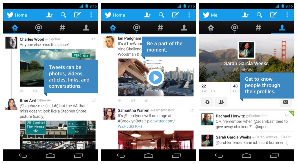
Twitter tests new designs from time to time in the beta version of its Android app. Some of those designs roll out widely and others don’t. But the design it’s testing right now really ought to, because it’s much better than what’s in use today.
A number of people using Twitter’s alpha and beta apps have begun seeing a design that places Twitter’s four core areas, the main feed, Moments, notifications, and direct messages as large tabs across the top of the screen. You can then move between them either by tapping on the tab or by swiping side to side, making it much easier to navigate and explore than the main version of Twitter’s app.
Those four tabs currently exist as tiny buttons at the top of the screen and have have to be individually tapped on and then exited from every time you want to use them. It really doesn’t encourage one to go anywhere but the main feed. The new design also opens up a lot of Twitter’s other features in a friendlier way. Right now, things like Highlights, settings, and even your own profile are hidden away in the menu. This test design allows you to access them from a pane that slides out on the left-hand side of the screen. It can also be accessed by tapping on your profile icon, which appears up top when you open the app but then collapses as you begin scrolling down the feed, opening up more screen space. Twitter also frees up some space by removing the three tweet buttons that ran along the bottom of the screen; instead, this design uses a Material Design-friendly floating button, which is present across most screens.


